CLIENT
Wine Country Olive Trees & Gardens
LOCATION
Napa Valley.
Industry
Landscape & olive trees · Napa Valley
Scope
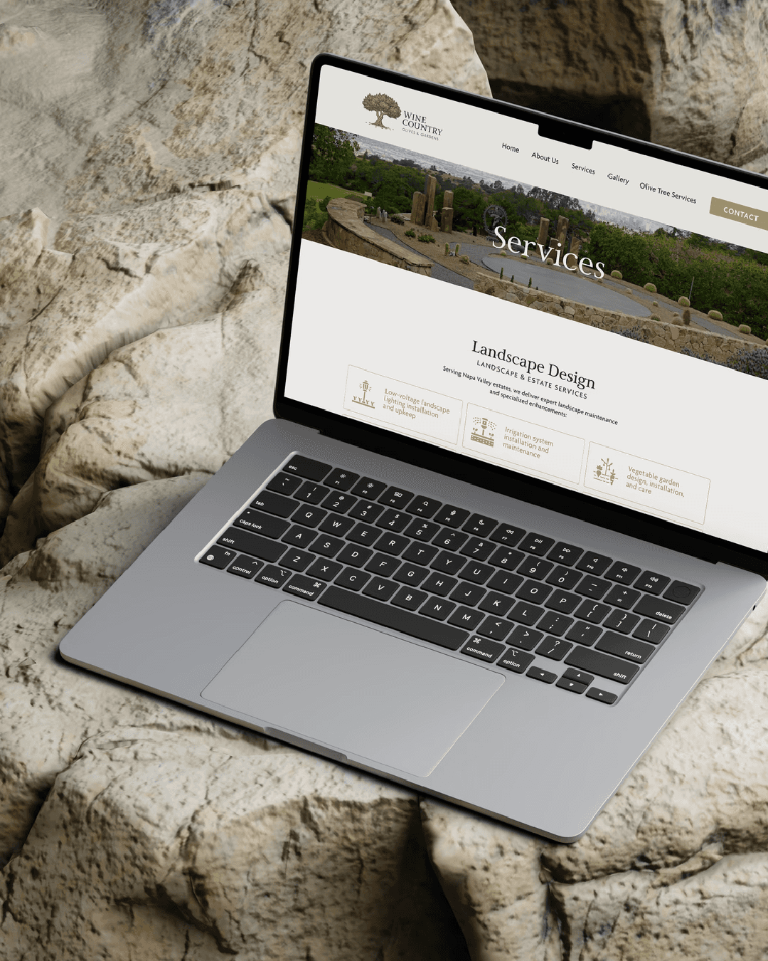
Brand identity Logo system Color & type Website
SYSTEM
Primary logo, stacked and horizontal lockups, seal, 4 colors, 2 typefaces
CHALLENGE
Wine Country Olive Trees & Gardens had outgrown an identity that no longer reflected the scale of the business or the caliber of clients it was serving. The rebrand needed to elevate the company’s presence while preserving the organic character and heritage behind the business.
STRATEGY
We made the olive tree the center of the brand system, not simply as a reference to the business, but as a symbol of roots, growth, resilience, adaptation and seasonal change. That idea gave the brand a meaningful visual anchor while supporting a more refined position for larger and more established clients.
IDENTITY
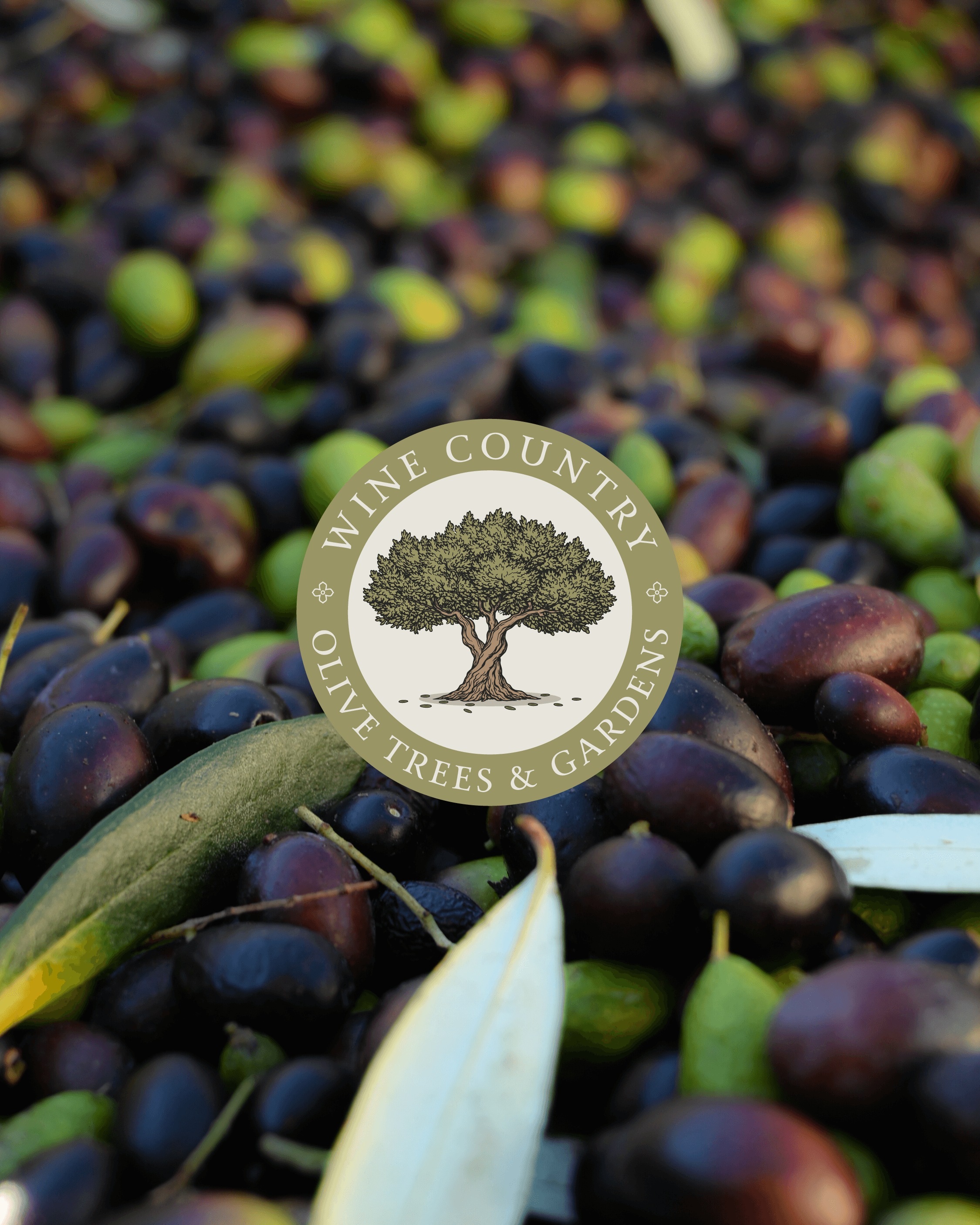
An engraved olive tree with intertwined roots anchors the identity, giving the mark an organic, established character while remaining recognizable across applications. A refined serif-led typography system, stacked and horizontal lockups, a circular seal and a palette of cream, tan, olive and charcoal create a flexible system designed to move consistently from signage and print to digital and web.
PROJECT GALLERY