CLIENT
Barril de Sabor
LOCATION
México.
Industry
Food & beverage
Scope
Brand identity Vehicle wrap Website
SYSTEM
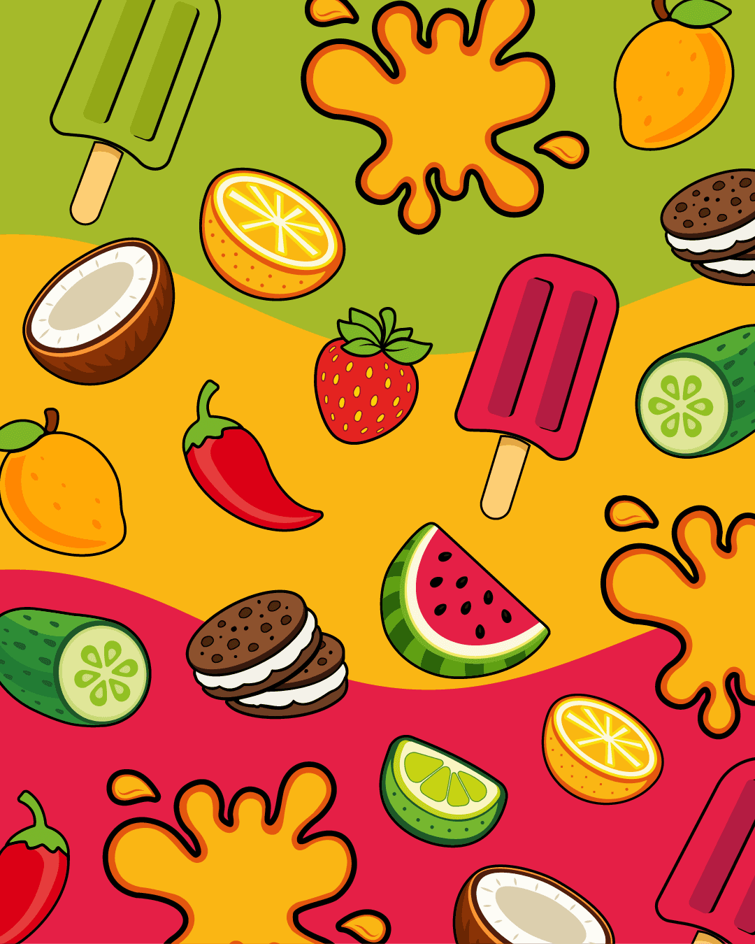
Primary logo, barrel emblem, 4 colors, 2 typefaces, 8 illustrated elements
CHALLENGE
Barril de Sabor needed an identity for a product people choose on impulse, in the street and in seconds. It had to read as appetizing before it reads as a logo, and it had to hold at every size the business actually uses, from a business card to the full side of a truck, without losing its energy.
STRATEGY
We turned the name into the picture. A barrel full of paletas and fruit, bursting out of an orange splash, puts the product inside the mark, so the brand stays recognizable even where the name is too small to read. The system was built color first and illustration first so it could fill large surfaces such as a vehicle wrap, and the brand line “Más que sabor, una causa” keeps the purpose inside the identity instead of in a separate campaign.
IDENTITY
The wordmark pairs green and yellow lettering with a green and a red popsicle over an orange splash, with a barrel emblem as the secondary mark for square and vertical formats. Light beige #FDEFB6, yellow #FAB614, green #A5BA2A and red #E51F46 make up the palette, Luckiest Guy carries display type and Raleway the text. Eight illustrated elements, from coconut and lime to chili and mango, extend the system across stationery, digital pieces and the vehicle wrap.

PROJECT GALLERY