
CLIENT
Carreto Auto Spa
LOCATION
Napa Valley.
Industry
Auto detailing
Scope
Logo & identity Color & type Website
SYSTEM
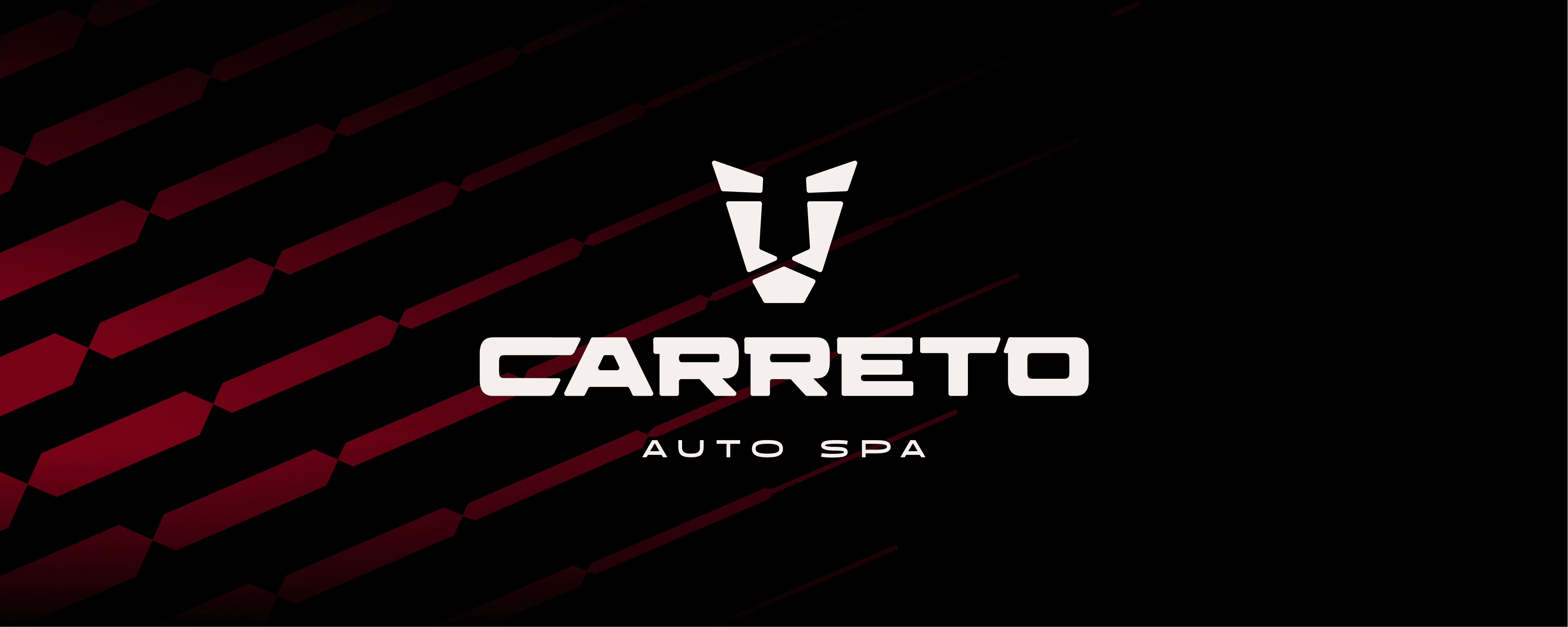
Lion isotype, wordmark, burgundy, black and warm white palette
CHALLENGE
Most car wash logos show the same thing: a car being washed. Carreto Auto Spa needed a logo that represented the client instead, without leaning on the category's usual imagery.
STRATEGY
We stayed away from car wash imagery. The identity is built on a lion isotype that works as the client's personal mark, paired with a sportier color palette aimed at the market Carreto wants to reach: owners of luxury and sports cars.
IDENTITY
A geometric lion isotype sits next to the Carreto Auto Spa wordmark. Burgundy, black and warm white give the brand a sporty, premium look that carries from social media to branded pieces like the leather key fob.
PROJECT GALLERY


